Visualizing Graphs
As you’ve probably noticed, visualizing computational graphs as diagrams plays a big role in this documentation, and these diagrams are extremely useful to understand and debug your own graphs. This section will demonstrate how you can customize the standard visualization for your own work.
First, let’s create a sample graph, and see the default visualization style:
[1]:
import contextlib

import graphcat

def sample_graph(graph):
    graph.add_task("A")
    graph.add_task("B")
    graph.add_task("C")
    graph.add_task("D")
    graph.add_task("E")
    graph.add_task("F")
    graph.add_task("G", graphcat.raise_exception(RuntimeError()))

    graph.set_links("A", "B")
    graph.set_links("B", "D")
    graph.set_links("C", "D")
    graph.set_links("D", ["E", "G"])
    graph.set_links("E", "F")

    return graph

graph = sample_graph(graphcat.StaticGraph())
The easiest way to visualize our new graph is to use Graphcat’s builtin functionality to display it in a notebook:
[2]:
import graphcat.notebook
graphcat.notebook.display(graph)

The diagram represents each task as a box labelled with the task name. Arrows point in the direction of data flow, from upstream tasks to the downstream tasks that depend on them. The tasks are drawn as outlines because they haven’t been executed yet:
[3]:
graph.update("E")
with contextlib.suppress(RuntimeError):
    graph.update("G")
graphcat.notebook.display(graph)

As you can see, the tasks that executed successfully are drawn as solid boxes, to suggest that they’re finished, while failed tasks (tasks that raise an exception), are highlighted in red.
Keep in mind that we’ve been looking at a StaticGraph. Let’s see what the same topology looks like when we use a DynamicGraph:
[4]:
graph = sample_graph(graphcat.DynamicGraph())

graph.update("E")
with contextlib.suppress(RuntimeError):
    graph.update("G")

graphcat.notebook.display(graph)

The new diagram is different in two ways: first, because this is a dynamic graph and task “E” doesn’t use any of its inputs (it’s using the default graphcat.null task function), none of the upstream tasks have been executed. This is expected behavior for a dynamic graph, see Dynamic Graphs for details.
Second, the arrows are drawn as outlines instead of solid. This is meant to suggest that the relationships are conditional and dynamic rather than static: an upstream task is only executed if the downstream task actually uses its output.
Let’s look at the equivalent StreamingGraph:
[5]:
graph = sample_graph(graphcat.StreamingGraph())

graph.update("E", extent=None)
with contextlib.suppress(RuntimeError):
    graph.update("G", extent=None)

graphcat.notebook.display(graph)

You can see that the streaming graph arrows are drawn as outlined half arrows, to suggest that the streaming graph is dynamic and that downstream tasks can request partial results from upstream tasks.
Now that we’ve seen the default behavior for diagrams, let’s look at the ways with which we can customize them.
First, depending on the size of your graph, the lengths of its task names, and the width of your screen, you may wish to display the graph with the data flowing top-to-bottom instead of the default left-to-right:
[6]:
graphcat.notebook.display(graph, rankdir="TB")

Depending on the reading direction of your language, you might also prefer right-to-left flow:
[7]:
graphcat.notebook.display(graph, rankdir="RL")

You could also render the flow bottom-to-top, if you’ve been working on your Tagbanwa:
[8]:
graphcat.notebook.display(graph, rankdir="BT")

Next, let’s start to modify the appearance of the graph, not just the layout. To do so, we’ll need to import a new module, graphcat.diagram, which is where all of Graphcat’s drawing actually takes place:
[9]:
import graphcat.diagram

agraph = graphcat.diagram.draw(graph)
The call to graphcat.diagram.draw() returns an AGraph, which is provided by the PyGraphviz library. Once you have an AGraph created by graphcat, you can use its API to make modifications. For example, you might want to change the appearance of a key task:
[10]:
agraph.get_node("C").attr.update(color="royalblue", fillcolor="royalblue", fontcolor="white", shape="circle")
To render the modified graph, pass it to the usual display function:
[11]:
graphcat.notebook.display(agraph)

You could also highlight an important relationship:
[12]:
agraph.get_edge("A", "B").attr.update(color="seagreen", penwidth="2", arrowhead="normal")
graphcat.notebook.display(agraph)

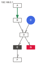
Or you could add a supplemental label to a task:
[13]:
agraph.get_node("A").attr.update(xlabel="192.168.0.1")
agraph.graph_attr["rankdir"] = "TB"
graphcat.notebook.display(agraph)

Finally, you might want to render your graph as a bitmap image instead of an SVG, which can be done directly using the pygraphviz.AGraph API:
[14]:
import IPython.display
IPython.display.display(IPython.display.Image(data=agraph.draw(prog="dot", format="png")))
Or, you might want to write the image directly to disk:
[15]:
agraph.draw(path="test.svg", prog="dot", format="svg")